Grey Cloud quartz speaks before the kitchen is ever used. Its message is quiet, composed, and deliberate. This surface doesn’t demand attention — it sets a tone.
That can be incredibly effective. It can also fall flat when the surrounding design doesn’t support it. Understanding what Grey Cloud communicates helps determine whether it’s the right fit for a space and how to design around it so it feels intentional rather than muted.
The First Impression: Calm and Control
Grey Cloud quartz immediately suggests order. The soft, diffused patterning avoids visual spikes, which makes the surface feel stable and grounded. In kitchens where simplicity and consistency matter, this creates a sense of calm before a single cabinet door is opened.
This is why Grey Cloud often appeals to homeowners who value structure, clarity, and long-term comfort over trends. It doesn’t chase attention. It holds it quietly.
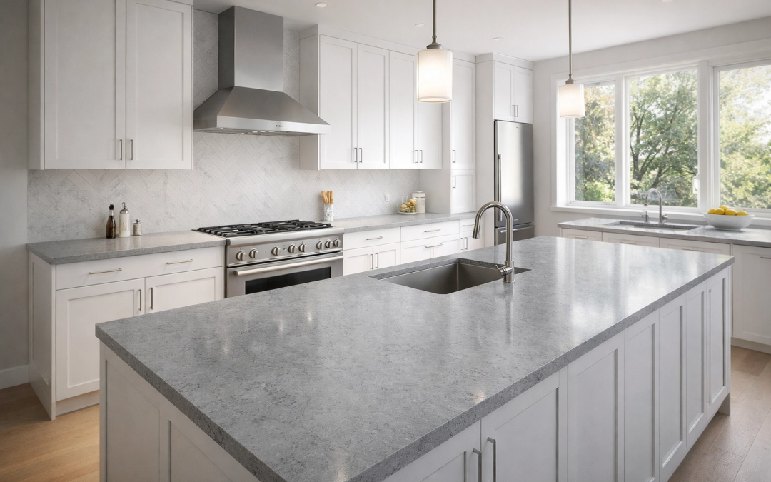
When Grey Cloud Feels Balanced and Modern
In well-considered spaces, Grey Cloud quartz feels refined and composed. It pairs naturally with clean lines, uncluttered layouts, and thoughtful material choices.
Warm metals such as brushed brass or champagne tones introduce contrast without disrupting the calm. Natural wood accents — even in small doses — add depth and keep the space from feeling overly restrained. Layered lighting plays a major role here, helping the surface stay visually alive throughout the day.
These elements don’t overpower the quartz. They support it.
Where Grey Cloud Can Feel Flat
Grey Cloud relies on its surroundings more than many quartz styles. In spaces with limited light or too many cool finishes, the surface can begin to feel subdued rather than serene.
Pairing Grey Cloud with multiple cool greys or stark whites often removes the contrast it needs to breathe. The result isn’t modern — it’s tired. The room loses energy because everything sits at the same visual temperature.
This doesn’t mean those elements are wrong. It means they need balance.
Introducing Warmth Without Losing the Look
The most successful Grey Cloud kitchens introduce warmth subtly. Flooring is a common opportunity, especially with wood or wood-look materials. Wall colors that lean soft and neutral, rather than crisp or blue-based, also help.
Hardware finishes, lighting temperature, and even textiles can shift how the quartz is perceived. These choices don’t change the quartz itself — they change how it communicates.
Grey Cloud responds well when the room speaks a little louder than it does.
Who Grey Cloud Quartz Is Best Suited For
Grey Cloud quartz works best for homeowners who want a kitchen that feels steady, controlled, and timeless. It supports daily living without visual noise and settles comfortably into long-term design plans.
It’s less suited for spaces where bold contrast or expressive movement is the goal. Those kitchens benefit from quartz styles with stronger veining or higher visual energy.
Grey Cloud doesn’t perform. It reassures.
Understanding the Message Matters
Choosing quartz isn’t only about color or pattern — it’s about what the space communicates once everything is installed. Grey Cloud speaks softly, which can be incredibly powerful when the rest of the room knows how to respond.
Seeing the surface in person helps clarify that message. Light levels, surrounding materials, and finish choices all influence how Grey Cloud feels once it becomes part of a home.
For those exploring Lethbridge Countertops or Penticton Countertops, visiting a showroom allows these nuances to become clear. Granite Rocks is one of the stone countertop suppliers serving both locations, offering the chance to view quartz surfaces under real lighting and alongside complementary materials.
You’re welcome to set up a quote or visit the Granite Rocks showroom in Lethbridge or Penticton to see how Grey Cloud quartz interacts with different design elements before making a final decision.